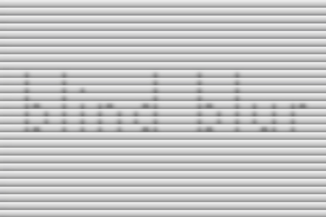
Blind Blur
Display Font
Project Summary
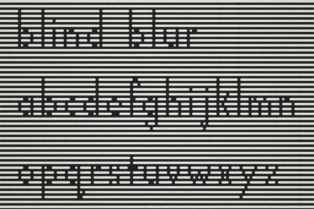
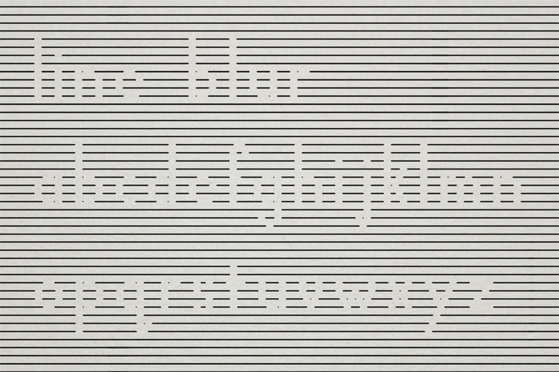
This display font was inspired by the visual effect of observing people's shadows through window blinds. I was intrigued by the interplay of light and shadow and translated that into a typeface that emphasizes negative space and optical illusion. Each character is composed of evenly spaced strait horizontal lines, with characters being formed through breaks in the line.
At close range, the type may appear abstract or fragmented due to its reliance on negative space. However, when viewed from several feet away, the letterforms become clear and legible. This intentional design choice plays with perception, encouraging viewers to engage with the font in a physical and spatial way.
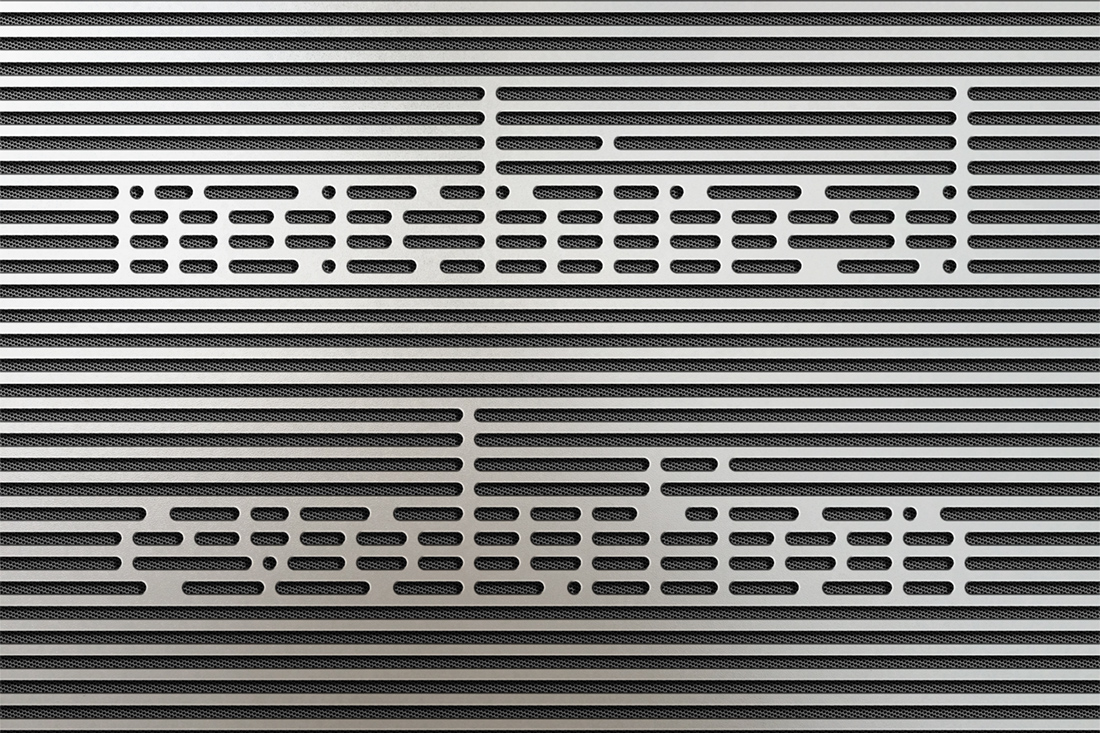
The horzontal line construction also makes the font good for laser cutting or stencil applications, allowing it to be produced as a single, cohesive object without the need for additional structural supports. This makes it both a functional and visually compelling choice for display-oriented design projects.